AI tools are now part of everyday design work, and many brands are using them to speed up early concepts. This shift has led to a mix of new styles that reflect both current digital habits and long-standing design needs.
How New Design Tools Are Shaping Logo Design
The real revolution isn’t visual; it’s procedural. You’ve stopped spending days sketching concepts that go nowhere. Instead, you use software like an AI logo generator. It lets you sort through many options quickly so you can narrow down the direction that fits.
![]()
This speed fuels the rise of “living” logos. Static marks feel less noticeable on today’s high-resolution displays. Brands now rely on fluid identities that shift. For example, it looks one way on a watch and another on a billboard, while staying recognizable. This kind of high-end elasticity used to belong strictly to the Fortune 500; now, it’s open to anyone.
Designers are allowing small digital artifacts to remain because they add character to the style. They are keeping the glitches and weird geometry that tools spit out, leaning into the digital noise. You’ve moved past the “stamp” mentality. A logo isn’t a fixed mark anymore; it’s a living system.
How AI Fits Into Logo Design Work?
More brands are turning to design tools that focus on a specific style instead of using broad generators that try to do everything at once. A football logo maker, for instance, is built around clear shapes and heavier lines, and those same qualities are showing up in tech logos because they stay readable in many different places. Tools like this make it easier to see how simple, direct design choices work across different industries when you need people to recognize a mark quickly.
The general move is toward logos that stay clear on small screens and in crowded app layouts. The shapes are simpler, the lines stay consistent, and the colors are chosen to hold up both online and in print. Brands using this approach aren’t trying to mimic sports teams; they’re choosing styles that remain steady no matter where the logo appears.

Create Logos With More Depth and Texture
After years of flat design, there is renewed interest in visuals that suggest depth and material texture. Glassmorphism has returned, but it is different this time. It isn’t just about blurring the background. It is about simulating physical materials. They call this “Glassmorphism 2.0” or “Digital Tactility.”
You see this trend heavily in fintech and high-end SaaS tools. The logos look like they are made of cut crystal or polished resin. They have deep, caustic lighting effects and subtle refractions. It makes the digital object feel expensive. On high-density OLED screens, these details pop. A flat circle is just pixels; these logos often use highlights and soft refractions to create a sense of depth on modern screens.
This is a direct response to the “spatial computing” conversation. Even if they aren’t all wearing headsets, they are designing for depth. Designers are adding subtle colored shadows to create a gentle lift and improve visual hierarchy. It adds hierarchy and focus.
When a user looks at a screen filled with information, a logo with depth acts as an anchor. It feels heavy and permanent. It conveys trust. You don’t get that same feeling from a flat vector shape anymore.
The Growing Use of Glitch Style Logos
On the flip side of the polished glass look is the “Glitch” aesthetic. This style is becoming more common in gaming and Web3 spaces. Fueled by Y2K glitches and cyberpunk grit, it runs on neon acid greens and void-like blacks. It’s the default uniform for Web3 and Gen Z gaming.
It intentionally breaks the rules. Logos are stretched, pixelated, or look like they are malfunctioning. It is a visual representation of the noise we live in. Instead of hiding the digital nature of the brand, it celebrates it.
It grabs attention because it feels raw. In a feed full of polished marketing, a logo that looks broken stops the scroll. It signals that the brand is authentic and a bit dangerous.
How X-Design Fits Into Current Design Workflows
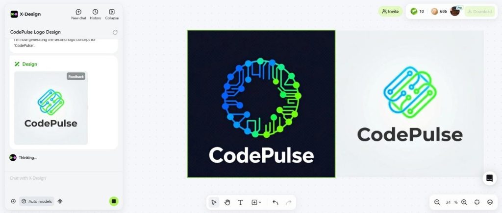
In this landscape of shifting trends, you need tools that can pivot quickly. This is where X-Design becomes relevant. It is an AI-powered platform that functions less like a traditional editor and more like a branding agent. It seems to understand that speed and consistency are the two biggest bottlenecks for modern creators.

What makes X-Design useful is its scope. Chasing a specific vibe like “Tribal Tech” or “Glassmorphism”? Just drop in your business name. The platform spins up a fully synced identity: logos, fonts, colors. It helps users move past the uncertainty that often comes with starting from a blank screen.
Beyond the logo work, its photo editing capabilities are significant for e-commerce and marketing. The “AI Background Generator” is particularly strong. Context understanding ability makes the tool highly relevant. Drop a basic product shot into a setting that actually sells the vibe, a sleek studio for tech, or a forest floor for an eco-brand. It handles the lighting and perspective matching automatically. X-Design also provides other types of photo editing tools like HD image converter, watermark remover, color changer, image generator, and more.
Logos need to work across many different environments, from social platforms to packaging. X-Design keeps your photography in lockstep with that vibe. You can scrub stray objects, upscale grainy shots, or swap backgrounds instantly—tightening your entire visual ecosystem in one go.
Conclusion:
Design teams now have access to tools that generate many variations quickly. They can generate a thousand variations in seconds and can simulate physics and light on a phone screen. But the tool is never the point. The point is the intent.
2026 is proving that while machines can generate options, only humans can curate meaning. People choose the glitch aesthetic because they want to signal rebellion. Trends vary, but the goal is simple: cut the noise. The best logos of 2026 won’t just be eye candy; they will serve as a clear marker of the community or audience the brand aims to reach.