Building a unique and solid brand identity is crucial to succeed in any competitive business landscape. The brand identity differentiates an ordinary brand from a well-reputed and well-established brand. To understand the importance of brand identity development, you must...
Most people associate video games with fun, entertainment, and relaxation. But if you’ve ever played a game that was so immersive that it felt real—like you were actually part of the story—then you know how much more powerful they...
Typography in branding is more than just the style of letters; it’s a powerful tool that communicates a brand’s tone, values, and personality. The typeface chosen for a logo can evoke emotions, create associations, and establish brand recognition. For...
In the dynamic world of branding, a logo is much more than just a graphic symbol; it’s a vital representation of a brand’s identity and values. Effective logo design is crucial in creating a lasting impression on the target...
When you think of an image, you might think of scenery, people, etc. However, not all images are like that. Some images have text embedded inside them. This means that images can display textual information as well. This is...
In the world of logo design, the selection of colors plays a crucial role in shaping the identity and perception of a brand. Colors evoke emotions, convey messages, and leave a lasting impression on the audience. When it comes...
Diving into the world of graphic design is quite awesome. Hey, it takes more than courage to do the job! So, it’s best to start your masterpieces with some cool tools, tips, and tricks. Image Source: Unsplash Easy-to-Do Awesome...
In today’s ever-evolving digital landscape, where attention spans are fleeting and competition is fierce, standing out as a brand is more challenging than ever before. It’s no longer enough for a logo to be a static symbol on a...
Everyone who owns a business dreams of making it successful and unique. Besides, none would deny their desire to create that appealing ‘wow’ factor that customers can’t resist. In the modern world, where digital marketing is everywhere and anywhere,...
Creating a minimalist logo that embodies your brand’s essence while being visually striking is a meticulous process. In this section, we’ll guide you through the steps and offer valuable tips for crafting a minimalist logo that stands out. 1....
In today’s fast-paced digital world, content presentation is as crucial as the content itself. Whether you’re launching a new product, tying the knot, or simply looking to convey information in a structured manner, Google Docs booklet templates come to...
Entrepreneurship is a journey that requires a fine balance of various elements to succeed. Brand perception and effective financial management are two foundational pillars when venturing into a global market. Both influences how potential customers perceive your business and...

Learning Management Systems (LMS) are software applications that enable administrators to manage and deliver educational courses and training programs. As an administrator, the effective management of your learning programs can be challenging, but by following the best practices, you...
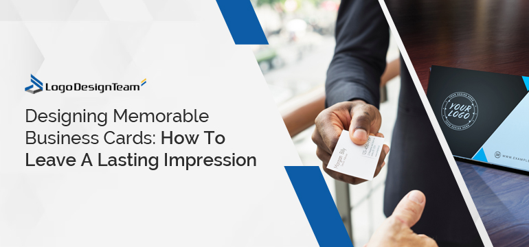
While the convenience and speed of digital interactions have become an integral part of modern professional lives, there is something distinctly powerful about tangible exchanges. This is where classic business cards come into play. Though small, these pocket-sized introductions...

As someone crazy about documenting your life, you probably have countless selfies and cherished memories captured. But let’s face it—your Mac is often the go-to vault for these moments, quickly transforming into a cluttered digital photo library. And if...
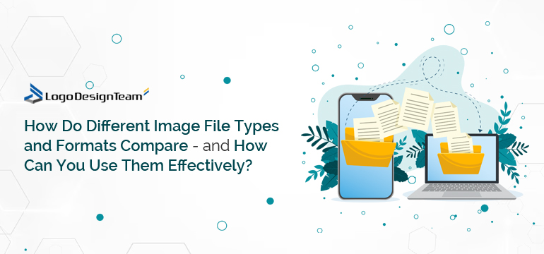
Image file types and formats are more than just mere extensions at the end of your image filename. They are a truly critical aspect in design or content creation, influencing image quality, size, compatibility, and even editing capabilities. That’s...
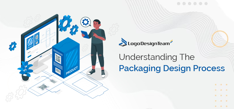
On the surface, a packaging design seems like a relatively straightforward process. But the reality is that multiple steps are involved between the initial design brief and the final product donning the supermarket shelves. From ensuring your final products...
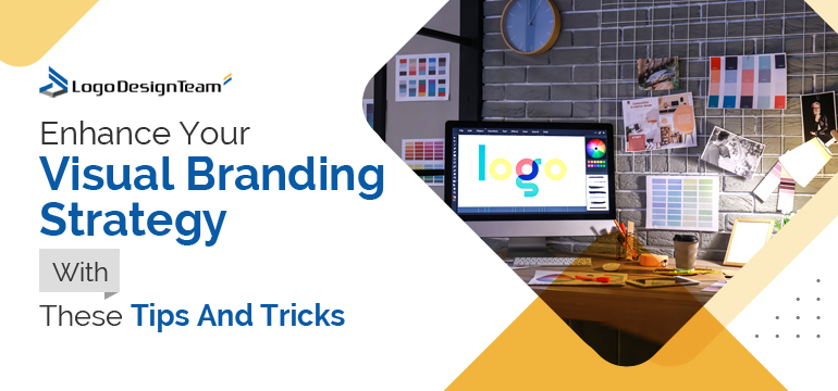
Imagine walking through a grocery store and instantly recognizing your favorite cereal from afar. That instant recognition is visual branding in action. In a nutshell, it’s a combination of elements like logos, colors, images, and fonts that make a...
Initiating your own business can be a refreshing and incredible journey. However, many find it challenging to portray their creative side. Yet, being innovative means you have exceptional graphics and logo designs. Your logo holds power as the visual...
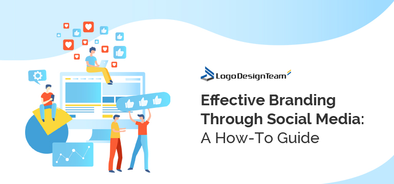
Imagine a world where your brand can connect with millions of people, ignite conversations, and leave an indelible mark on the digital landscape. Social media transforms how people communicate, share stories, and discover new horizons. It can amplify your...